The NFL recently decided to retract their policy of only allowing one helmet per player per season, which will allow teams to add an alternate lid to their uniform rotations beginning in the 2022 season.
Throughout the years, we’ve seen many unique throwback jerseys and some completely miss the mark due to the color clash caused by the one-helmet policy. It had been adapted because the NFL believed that helmets needed to be “worn in”. Players broke them in during offseason workouts, and could not switch midseason as it was deemed a concussion risk.
Research has proved the NFL’s idea to be bogus as new information has come in on football, concussions, and CTE, so now it’s time to let Nike get to work.
Since taking over as the NFL’s uniform outfitters, the Oregon-based company has remained traditional in most of their re-brands. However, now that teams can sport multiple buckets throughout the season, we’re likely going to see them push the envelope more. We’ve seen some crazy Nike designs before, with collegiate programs like Oregon and Baylor, along with some hits and misses throughout the MLB and NBA. I think that we will finally see Nike look to do the same in the NFL.
That’s why I mocked-up a few possible designs that I think the Buffalo Bills should look into for the 2022 season…
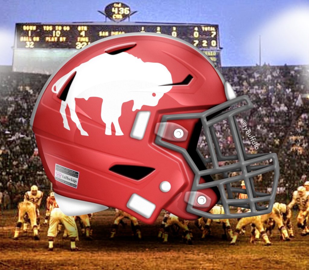
Chunky Buffalo
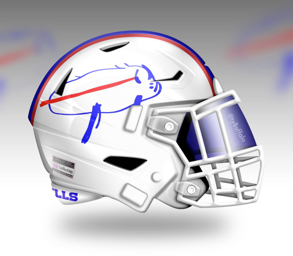
Technically, the Bills could wear this helmet this season as it’s still white, but I needed this logo on a helmet. By now, we’ve all seen Josh Allen’s attempt at drawing the Bills logo and it was pure gold! The young quarterback is clearly no Picasso (shoutout Picasso’s Pizza), but has shown his ability to create masterpieces on the field.
The “chunky buffalo”, as many affectionately refer to the drawing, has found its way onto all sorts of merchandise around the city of Buffalo. It will even find its way onto MereKat‘s body in about a month and I’m extremely jealous! The only thing missing will be Josh’s John Hancock in the bottom right corner of his artwork.
P.S. White facemasks for the win!!!
Blue Standing Buffalo
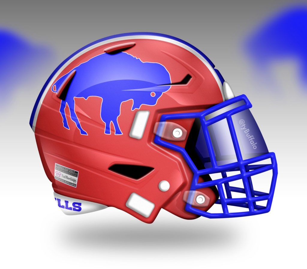
This design features the traditional red helmet with blue and white stripes that the team adorned from 1984 until 2010, but with a different logo. The color combination is undoubtedly the best in the NFL and dare I say the world (I can’t wait to bet on the USA in every Summer Olympics event).
For the logo on this helmet, I flipped the standing buffalo to blue and then added a white trim to make it really pop on the red shell. I elected for a blue facemask with this look to match the buffalo itself and I think it’d be a unique look for the Bills. The team only wore the blue facemask with a red shell from 1984-86.
I’m not saying the Bills need to use my design for this one, but I think I speak for all of Bills Mafia including the players when I say we want the 90’s throwback red helmet and jerseys!
Blue Flip
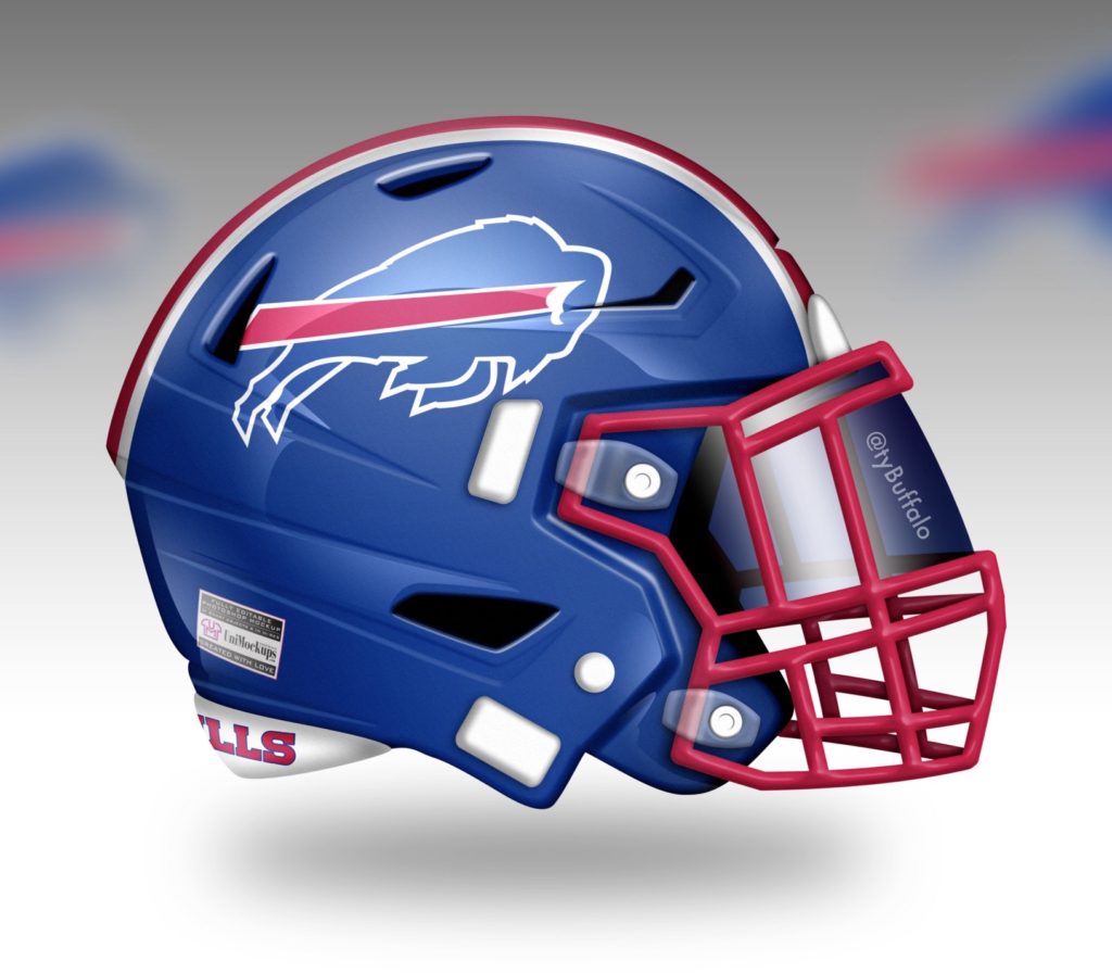
For this helmet, I went back to the thought of the aforementioned red shell, but flipped it. The Bills have never worn a blue helmet in franchise history, so it would be a great time to debut one in 2022. This could pair very well with the red jerseys while adding to the amount of different red, white, and blue variations that the Bills could sport.
Out of all the designs I made, I believe this is the one that we could most likely see put into action. The organization proved they listen to the fans when they made the jump to white facemasks full-time, but will they finally give us a blue helmet? I think it’d be the perfect big game look for the franchise.
Rockpile Red
Rockpile Red features an exact flip of the original white helmet with red standing buffalo and single stripe that the team began wearing just shortly after its inception. This helmet gives fans the colored helmet that they never got while the team played in the beloved Rockpile.
From 1960-72, the Bills of yesteryear sported only the white helmets, but with the lack of general color in their lives without colored television, print, etc., we owe it to our forefathers to bring them some color! Plus it honors those who helped build the franchise on the field such as quarterback Jack Kemp, head coach Lou Saban, and a certain running back who shall not be named.
I know someone out there is complaining about the grey facemasks (and probably how I spelt grey), but they are meant to be true to the originals which also featured a grey facemask. This was around the beginning of true hard shell helmets and they featured completely different styled masks, but nonetheless we’re staying true to the retro look.
City Edition
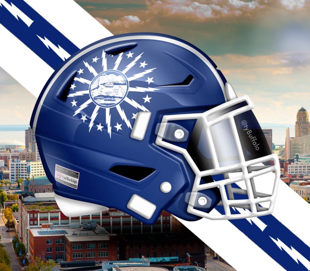
Nike has gone and made city edition jerseys in the NBA and has started the same trend now within the MLB. It only makes sense they they would further their foray into the connection between uniform and city with an NFL version. .
This design features the traditional almost-navy blue of the Buffalo’s City flag with white accents. The logo features the seal of the city within a series of 13 lightning bolts and 13 stars. The 13 stars represent New York’s status as one of the original 13 colonies as the bolts are meant to represent the energy of Buffalo’s spirit as well as the fact that the city was one of the first to offer electricity.
I chose to use two white stripes white bolts going through the middle of the blue. It’s a nod to the look of the flag and the current energy helping this city revitalize itself. This might be my favorite design of all and even if the team doesn’t wear this, I might need to get. one made for myself!
Which helmet did you like most? Which would you like to see Josh Allen adorn at Highmark Stadium? Lets me know over on twitter @TyBuffalo.